
Revenue First Ecommerce A/B Testing With Real Client Wins
Revenue First Ecommerce A/B Testing With Real Client Wins

Yes, run A/B tests, and start with product pages and checkout. Pick one hypothesis with real revenue upside, confirm your traffic can hit the sample size within a couple of weeks, and build the variant around that single change. If your store gets fewer than a few thousand visitors a week, lean on session recordings and customer feedback first. Save split testing for the changes big enough to actually move the numbers.
TL;DR:
- Focus initial A/B tests on product pages and checkout flows, where small improvements can lead to significant revenue gains without additional ad spend.
- Prioritize tests with a clear revenue upside, such as changing CTA text or formatting prices, that can reach statistical significance within a few weeks using your current traffic.
- Use proper measurement tools like analytics platforms and sample size calculators before launching to ensure reliable, actionable results.
- Avoid testing small cosmetic changes or overlapping experiments, and always analyze segment-specific data to prevent misleading conclusions.
- Run tests for at least two weeks or until reaching the calculated sample size to account for full weekly shopping patterns and prevent premature stopping.
Table of Contents
- Why a/b testing for ecommerce actually moves revenue
- What is A/B testing and how does it work?
- High-impact pages to test first (and what to test on them)
- Tools and technical prerequisites for reliable tests
- The step-by-step process for running a test that actually tells you something
- PIE and ICE: how to decide what to test next
- The mistakes that quietly waste your testing budget
- What real ecommerce A/B testing programs actually look like
- What I’d test first if I only had one shot
- How Avestaagency turns test results into a rebuilt store
- Sources
- FAQ
Why a/b testing for ecommerce actually moves revenue
A/B testing works because it extracts more value from traffic you’re already paying for. You’re not buying more visitors, you’re converting a bigger share of the ones already on the site, which is the cheapest revenue lever most ecommerce owners have sitting untouched. Guidance from HubSpot’s conversion optimisation research makes the same point: as acquisition costs climb and ad platforms get less predictable, the businesses that win are the ones squeezing more out of existing sessions rather than chasing fresh clicks.
The compounding happens in specific places. Product pages and checkout flows sit closest to the purchase decision, so a lift there tends to outperform an equivalent lift on a homepage banner. A small conversion rate improvement on a high-traffic store can mean thousands of extra orders a year, with zero extra ad spend.
Statistical Reality Check: Not every winning test scales the same way. A checkout fix that recovers even a slice of abandoned carts often outperforms a homepage redesign in absolute dollar terms, because checkout traffic is already primed to buy. Prioritise by revenue potential, not by how visible the page feels.
That’s the whole case for testing over guessing: it turns “I think this would help” into a measured number you can defend to a business partner or a board.
What is A/B testing and how does it work?
A/B testing (also called split testing) splits your traffic randomly between two or more versions of a page: the control, which is your current design, and one or more variants that change a specific element. Visitors get randomly assigned to one version, and their behaviour gets tracked against a defined goal, usually a purchase, an add-to-cart, or a checkout completion.
There are a few flavours worth knowing:
A/B testing compares two full versions of a page against each other, ideal when you’re testing one clear change like a new CTA or a different price display.
Multivariate testing tests combinations of several elements at once (headline plus image plus button colour, for example), but it needs far more traffic to reach significance because you’re splitting visitors across more combinations.
Redirect tests send users to an entirely different URL, useful when you’re testing a structurally different page, like a new checkout flow hosted separately from the old one.
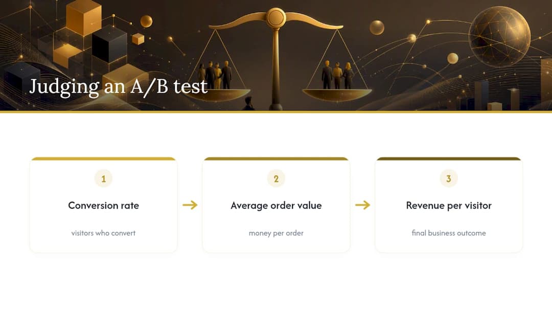
The metrics that matter in ecommerce user experience testing aren’t just “did the conversion rate go up.” You want three numbers side by side: conversion rate, revenue per visitor (RPV), and average order value. A variant can lift conversion rate while quietly dragging down average order value, which nets out to no real gain. RPV catches that. It’s the single metric that tells you whether a “win” actually made the business more money.
High-impact pages to test first (and what to test on them)
Not every page deserves equal testing attention. Product pages and checkout convert intent into revenue directly, so they should sit at the top of your list well before you touch a homepage hero banner.
- Product page hero image. Swap a studio shot for a lifestyle or in-use image (or vice versa). Image choice regularly swings add-to-cart rates because it’s the first thing a visitor evaluates.
- CTA text and placement. Test “Add to Cart” against something more specific like “Get It by Friday,” and try moving the button above the fold versus sticky-on-scroll.
- Price formatting. Test showing a strike-through original price next to a sale price, versus a flat discounted price with no anchor. Anchoring can lift perceived value without changing the actual discount.
- Review and social proof placement. Move star ratings and review counts closer to the buy button instead of burying them below the fold.
- Guest checkout prominence. Make guest checkout the default visible option instead of hiding it behind a “create account” prompt. Forced account creation is one of the most common ecommerce checkout complaints.
- Cart field order and shipping reveal timing. Show shipping costs earlier in the flow instead of at the final step. Surprise costs at the last screen are a classic cause of abandonment.
- Checkout progress indicator. Add a visible step tracker (Step 1 of 3) so users know how much is left, which reduces the anxiety of an open-ended form.
- Homepage and collection page layout. Test grid density, filter placement, and featured-product carousels, but expect smaller effect sizes here than on product and checkout pages.
As a rule, bold contrasts beat incremental polish, at least early on. Testing button colour from blue to slightly darker blue rarely produces a signal worth acting on. Testing a completely restructured product page against your current one, or a one-page checkout against a three-step checkout, gives you a result big enough to actually learn from. Backlinko’s research on conversion optimisation backs this up directly: meaningful differences produce clearer, more actionable signals than cosmetic tweaks. Save the fine-tuning for once you’ve found the big wins.
Tools and technical prerequisites for reliable tests
Running a valid test means having the right measurement layer before you touch a single pixel. Skip this step and you’ll get a result you can’t actually trust.
- Analytics platform (GA4 or equivalent). This is where revenue per visitor and conversion tracking live. Without clean ecommerce tracking configured, you’re testing blind.
- Session recording and heatmap tools. These generate the hypotheses worth testing in the first place, by showing you where users hesitate, rage-click, or abandon a form.
- Experiment platforms. Visual editors let non-developers spin up simple variant changes fast; code-based platforms give more control for structural changes like a rebuilt checkout flow. Tool categories for conversion testing break down when each approach fits.
- Sample-size calculators. Non-negotiable before launch. Run the numbers first so you know if your traffic can even reach significance in a reasonable window.
- Platform integration checks. If you’re on Shopify, native testing capability is limited, and most merchants need a third-party app or a theme-safe implementation to test checkout or pricing changes without breaking the payment flow. WooCommerce stores face similar plugin-compatibility checks before deploying any variant that touches cart logic.
Pro Tip: Before you build a single variant, do a dry run in staging and check that your experiment platform doesn’t conflict with your theme’s checkout scripts. A broken “Buy Now” button during a live test can cost you more than the test could ever recover.
The step-by-step process for running a test that actually tells you something
Every reliable test follows the same five stages, and skipping one is usually where good ideas turn into wasted traffic.
-
Research first. Pull from four sources: analytics data (where’s the drop-off?), heatmaps (where do people hover or ignore?), session recordings (where do they get stuck?), and direct customer feedback (what are they actually complaining about in support tickets or reviews?). A hypothesis built on one data point is a guess. A hypothesis built on all four is a genuine insight.
-
Write the hypothesis using a fixed template. “If we change [X] to [Y] because [Z], we expect [metric M] to change by [N] for [audience S].” For example: “If we move shipping cost disclosure to the product page because 40% of our cart abandons happen at the shipping step, we expect checkout completion rate to increase by 5% for mobile shoppers.”
-
Calculate sample size before you build anything. Use a sample-size calculator with your current baseline conversion rate, the minimum detectable effect you care about, and a standard confidence level. This tells you how many visitors per variant you need, and therefore how long the test will actually take given your traffic. Sample-size discipline is one of the core rules separating a valid experiment from a coin flip. Decide your primary metric (usually RPV or conversion rate) and one guardrail metric (like average order value, so you catch a variant that “wins” by cannibalising basket size) before launch, not after you’ve seen the results.
-
Run it for a full cycle, no peeking. Minimum two weeks, or until you hit your calculated sample size, whichever is longer. A week captures weekday behaviour but misses weekend shoppers entirely, and checking results daily and stopping the moment you see a “win” is how false positives sneak into your roadmap. Backlinko’s testing framework flags exactly this discipline: predefine your stopping point and stick to it.
-
Analyse properly, including segments. Look at the overall result, then break it down by new versus returning visitors, and by device. A variant that wins overall but loses badly on mobile (where most of your traffic probably lives) isn’t actually a win. If the result sits right on the edge of significance, don’t round it up to a decision. Extend the test, or treat it as inconclusive and move to the next hypothesis.
-
Implement and document. Ship the winner, but also write down what you learned, even from a losing test. A documented “big CTA text change didn’t move the needle” saves the next person on your team from re-running the same experiment in six months.
PIE and ICE: how to decide what to test next
You’ll always have more test ideas than traffic to run them, so scoring frameworks matter more than instinct. Two are worth knowing.
- PIE scores each idea on Potential, Importance, and Ease, each rated (say) out of 10, then averaged. Potential asks how much room for improvement exists on that page. Importance asks how much traffic or revenue flows through it. Ease asks how hard the build actually is.
- ICE scores Impact, Confidence, and Ease the same way, with Confidence reflecting how strong your supporting data already is, versus a pure hunch.
- Both frameworks work because they force you to write down the trade-off instead of testing whatever the loudest person in the meeting suggested.
A quick example: say you’re weighing a checkout field reduction against a homepage banner refresh. The checkout change scores high on Impact (it touches every buyer) and high on Confidence (your session recordings show repeated drop-off at that exact field), even though it needs a developer. The banner refresh is easy to build but scores low on Impact, because homepage traffic that never gets near checkout barely moves revenue. Checkout wins the priority queue even though it’s the harder build.
Feed traffic volume and expected effect size into the score too. A high-impact idea on a page nobody visits still won’t reach significance in a useful timeframe.
The mistakes that quietly waste your testing budget
Most failed testing programs don’t fail because of bad ideas. They fail because of process shortcuts that feel harmless in the moment.
- Stopping early because the graph looks good. A variant can lead by 15% on day three and completely regress by day twelve. Commit to your calculated duration before you look at results, not after.
- Testing changes too small to matter. A button colour swap on a low-traffic page will rarely produce a clean signal, and you’ll burn weeks proving nothing.
- Running multiple overlapping tests on the same page. If you’re testing checkout copy and checkout layout simultaneously, you won’t know which change caused which result, an interaction effect that quietly corrupts both tests.
- Ignoring segments. A result that looks flat overall can hide a strong mobile win cancelled out by a desktop loss, or vice versa. Always check the split.
- Skipping guardrail metrics on checkout tests. A pricing test that lifts conversion rate but tanks average order value has quietly cost you money while looking like a win in the dashboard. Set the guardrail metric before launch, not after.
What real ecommerce A/B testing programs actually look like
The pattern that shows up across successful optimisation work is consistent: the biggest wins come from testing the pages closest to the purchase decision, not the flashiest redesigns.
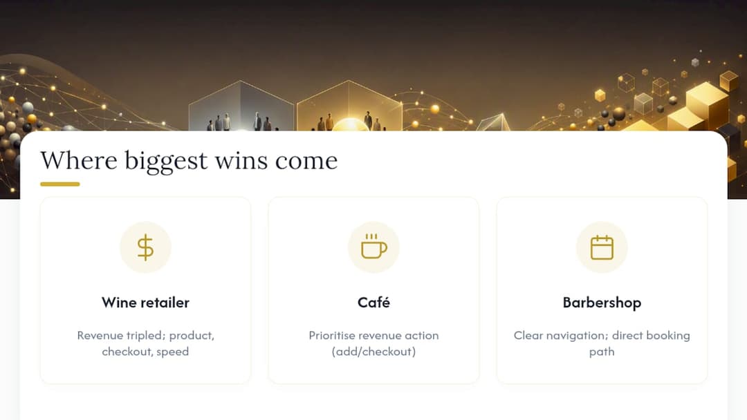
A wine retailer saw online revenue triple after a rebuild focused on product presentation and a smoother path to purchase, the kind of result that comes from prioritising checkout and product-page friction over cosmetic homepage changes.
That result tracked directly with where the effort went: cleaner product imagery, a simplified path to checkout, and page performance work that meant the store didn’t lose mobile shoppers to slow load times before they ever reached the buy button.
A café project told a similar story from a different angle. The lesson translates directly to ecommerce: whatever action represents your actual revenue event (add to cart, checkout, booking) deserves to be the most visible, frictionless thing on the page, not competing with five other calls to action for attention.
A barbershop site build reinforced the same principle from the design side: clarity in navigation and a direct path to the primary action (in that case, booking) consistently outperforms a cluttered page trying to do everything at once. You can see how that structural thinking plays out in the Barbershop Website project.
The operational takeaway across all three: pick the one action that makes you money, strip away anything competing with it, and measure the change in real numbers, not gut feel.
What I’d test first if I only had one shot
If I had to pick a single starting experiment for most ecommerce stores, it’s the product page CTA and price presentation together, because that combination sits directly on top of the purchase decision and usually has enough traffic to reach significance fast. Homepage tests feel safer because they’re low stakes, but low stakes usually means low reward too.
Revenue per visitor should be the number you report to yourself, not just conversion rate. It’s harder to game and it’s the number that actually reflects whether the business made more money. The stores that get the most out of testing treat it as a permanent operating rhythm, not a one-off project you run for a quarter and then forget. Run one test at a time, finish it properly, then move to the next hypothesis on your priority list.
— Armin
How Avestaagency turns test results into a rebuilt store
Winning a test is only half the job. Someone still has to build the variant properly, make sure it doesn’t break checkout on mobile, and ship it without tanking page speed. That’s where a lot of in-house testing programs stall, not on ideas, but on execution.
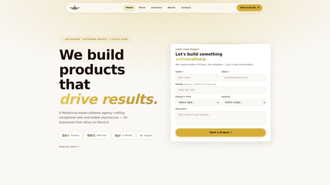
Avestaagency handles that execution end to end. The services cover the exact lifecycle a testing program needs: web development to build variants properly, UI/UX design to turn a hypothesis into a real interface, and performance and SEO auditing to make sure a “winning” checkout doesn’t quietly slow the whole site down. Every project runs through senior engineers directly, with no junior hand-offs, and the agency takes on a limited roster of clients so testing and optimisation work gets sustained attention rather than a one-off sprint. If your store has test ideas piling up faster than your dev capacity can ship them, get in touch with Avestaagency about turning the next one into a live variant.
Sources
- Conversion rate optimization (CRO) strategy for 2026
- Ecommerce A/B Testing Guide | ConversionStudio
- Conversion rate optimization guide — Backlinko
- Customfit
FAQ
Does Shopify allow A/B testing?
Shopify’s built-in testing tools are limited, so most merchants add a third-party app or theme-safe implementation to run product page or checkout experiments safely. Always check compatibility with your theme and checkout before launching a live variant, since a broken payment flow costs far more than a delayed test.
How much does A/B testing cost?
Cost depends on whether you’re using a self-serve experiment platform or commissioning a developer to build and implement variants properly. Avestaagency’s project-based development and optimisation work is priced per engagement, with current details available directly through the services page.
What are the 5 C’s of ecommerce?
Definitions of the “5 C’s” vary across marketing sources, so there’s no single agreed standard. Rather than force-fitting one, focus your energy on what’s actually proven to move revenue: testing product pages, checkout flow, and clear calls to action.
Can AI do A/B testing?
AI tools can help generate test hypotheses, analyse segment-level results faster, and flag statistically significant patterns, but the sample-size discipline and no-peeking rules still apply regardless of what analyses the data. As acquisition costs shift with AI-driven ad platforms, optimising existing traffic through structured testing matters more, not less.
How long should an ecommerce A/B test run?
Run tests for a minimum of two weeks, or until you hit the sample size your calculator recommends, whichever takes longer. This captures a full weekly cycle of both weekday and weekend shopping behaviour, which a shorter test will miss entirely.